Data Interpretation Questions looks to be a calculative section, but when you look closely into the section, then this section is not so difficult to attempt. The number of questions is 5-10 in the prelims exam, while for the mains part, it is a full-fledged section of 40 questions( including Data Sufficiency)
The various question types which come in Data Interpretation is
A brief description of various data types asked is given below
Table Graphs
Tables are often used in reports, magazines, and newspapers to present a set of numerical facts. They enable the reader to make comparisons and to draw quick conclusions. It is one of the easiest and most accurate ways of presenting data. They require much closer reading than graphs of other forms and hence are difficult and time-consuming to interpret.
One of the main purposes of tables is to make complicated information easier to understand. The advantage of presenting data in a table is that one can see the information at a glance.
Pie Charts
They derive their name from its shape, like that of a pie divided into various portions. They always represent data in the form of a percentage of the total, with the total percentage being 100. In such a chart, the length of the arc (and therefore the angle each sector subtends at the center) is proportional to the quantity it represents. Such charts are often used in the corporate world and in newspapers. Since a circle comprises 360 degrees, each percent of a pie-chart is equal to 360 divided by 100, or 3.6 degrees. This fact will be important for the calculations you are expected to perform.
Bar Graphs
Bar graphs represent data in the form of columns or bars. Bar graphs can be horizontal or vertical. The length of the bar is proportional to the data value represented by it.
Line Graphs
The line graph represents data in the form of straight lines that connect various data values. Both line graphs and bar graphs are used to convey some things and hence can be used interchangeably. For example, a line graph can be generated by joining the tip of the bar graph.
Caselets
In cases, the mathematical data is represented in the form of a paragraph. Hence extracting data and establishing relationships between different data values becomes difficult. However, cases are very popular with the examiners.
Combined Data Sets
Data is represented in two or more different types of data sets. It could be a combination of a table and a graph or two or more similar graphs. You may have to correlate the data in different data sets to solve these questions. Thus interpreting data takes time. These types of sets are very commonly asked.
The various concepts which are commonly used in Data Interpretation questions are given below
Some tips to Score well in DI section
Careful Reading: The first and the most important step in solving any Data Interpretation question is to read the question carefully. Many times, the data are given below the graph turns out to be more important than most of the numbers in the graphs. The next step should be to analyze the given graph/data carefully. Do not try to see the questions first and find out the answers accordingly. You will waste your time if you follow that method. Try to understand the graph. Instead, do the reverse. What is the graph all about? Which years does it cover? Is the data in absolute terms or in percentage terms? What do the two-axis signify?, etc. Look at the statistics for each graph, chart, table or pie diagram. Look carefully at the labels. Make sure you understand the central theme of the data.
Visual Estimation
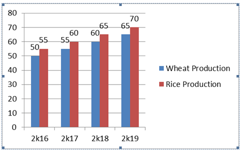
In which year the percentage increase in Wheat production was highest?
We see that although the increase is the same, the percentage increase is highest when the base is lowest. Hence the percentage increase is highest in 2017.No Calculation is required.
Finding Averages
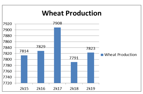
The average Wheat Production in this case can be done very easily. Lets keep the base value as 7800
Then increase over 7800 is 14,29,108,-9 and 23. The sum of these values is 165. The average is 165/5 = 33. Hence the average is 7800+33 = 7833.
Using Approxmiation: You can use approximation techniques to solve some of the questions. Please go through THIS Article
More preparation articles in our next column.
Verifying, please be patient.